Summary / TL;DR
At TheoremOne, we have found that we run into the same small, derailing conversations from project-to-project. These conversations can be difficult to navigate if they involve subjectivity. One example would be buttons. Specifically, button alignment and sort order. So, here’s some quick objectivity for ya:
- Page-level form buttons: align them to the right, sort them primary-to-secondary from left-to-right.
- Modal/dialog terminating action buttons: align them to the right or consider center alignment. In this article, we user-test to discover the ideal modal button sort order. 🚨 Spoiler alert: primary-to-secondary from left-to-right wins!.. but not by much. Order here likely doesn’t matter much as the UX is hardly changed, as long as you keep a couple of things in mind.
- This article deals with web application interfaces, web forms, and dialogs. But, the principles are generally universal.

Let’s Talk Buttons
Ahhh yes, buttons, arguably the most used interface element across digital platforms. Buttons are often the most debated element as well. Buttons have been a source of pain for new digital products and design systems. This source of pain comes from the subjective characteristics that surround button patterns. If you’re reading this article, you’ve probably had too many conversations about button label, size, color, alignment, sort order, and even state more than once. Let’s try and remove this ambiguity and define objective rules.
What are some general objective rules we already know?
- We know buttons need to be clear. Buttons need to clearly indicate their action through specific labels, colors, and iconography. Buttons should not be vague or misdirect users.
- We know buttons need to be consistent. Button labels, styles, and usage must be implemented consistently throughout the product. Inconsistent use may confuse a user into committing an undesired action.
- We know buttons need to indicate priority. Buttons need to indicate their priority within the context of the UI. For example, confirmation buttons associated with a previous action should be emphasized over a cancelation action.
- We know buttons need to be accessible. Buttons need to be usable and distinguishable by all users. Physical handicap, mental handicap, or technology preference should not impact button usability.
What are some general rules we don’t know or are often a source of debate?
- We don’t know the button alignment, or it is often debated.
- We don’t know the button sort order, or it is often debated.
- We don’t know if the button alignment/order needs to be consistent in all containers.
Let’s fix this and bring some clarity to these subjective troublemakers. Or, at least, define a start point to add objectiveness to these conversations.
What is Button Alignment & Sort Order?
Button Alignment
Button alignment refers to the direction a button group aligns to within its parent container. For example, a page-level button group may align to the left of a container. Or, a button group within a modal dialog may align to the right of its container (the modal dialog).
Button Sort Order
On the other hand, the Button sort order refers to the order in which buttons appear based on priority. Often there are at least two buttons associated with an action. There’s typically a primary affirmative action (“Ok,” “Submit,” “Create”), and a secondary dismissal action (“Cancel, “Close”). Of course, there can be more actions as well.
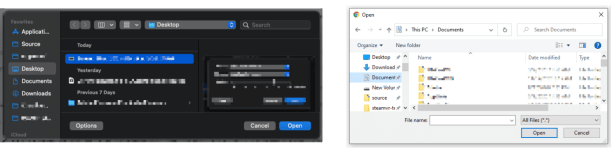
Below are a couple of examples of button alignment and sort order in popular products:
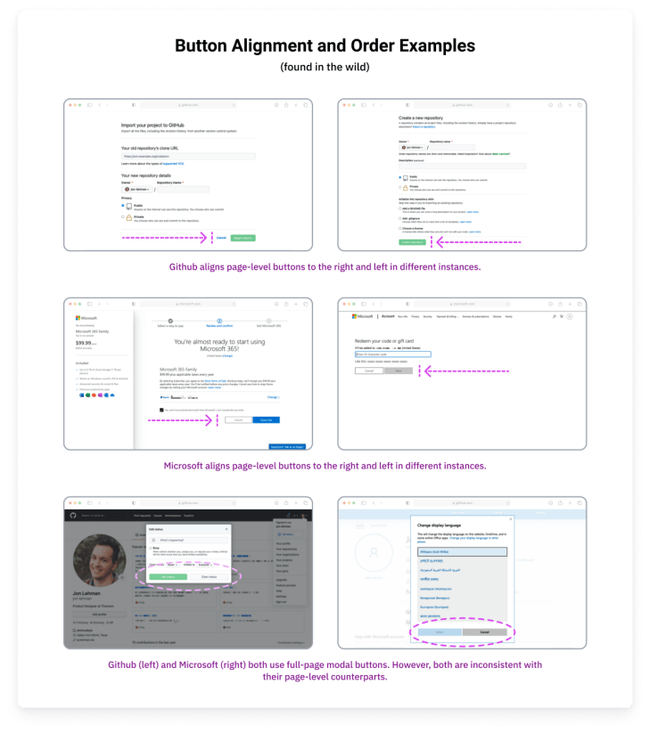
Products handle the button alignment and sort order differently. Some of the examples shown seemingly have alignment and sort inconsistencies within the same product.
Ok, each web product handles it a bit differently.. but what should I do?
I’ll let you in on a secret. As long as you follow a consistent rule throughout your product you can’t go wrong (testing and listening to your users is also a good idea 😉). IBM’s Carbon Design System is a great example of solid button alignment/order guidance.
The Carbon Design System guidelines define how buttons should be aligned and ordered in an obvious and concise way:
- Left Align Buttons for Banner call to actions, in-page forms, and nested buttons in components like tiles
- Right Align Buttons for Inline notifications, inline field buttons and data tables, progressive forms, wizards, and single-button dialogs
- Full-Span Buttons for Dialogs, side panels, and small tiles; currently, Carbon does not offer a way to implement full-span buttons in code; without an override, they max out at 320px
- Sorted Buttons Primary Left: full-page designs
- Sorted Buttons Primary Right: wizards and dialog windows
Ok, great, be consistent… but my stakeholders need rationale, stats, and research. What do I do?
The Problem
The web is a wild place. Users access the web from a variety of devices, platforms, and browsers. Each upstream product has its own guidelines for these sorts of patterns. We’re left deciding for ourselves what guidelines to abide by for our web products.
Some Answers
Button alignment and order on a page layout are actually pretty straightforward. Most of the time, it’s ideal to left-align the button group and sort the buttons primary-to-secondary from left-to-right. The following research backs this rationale up:
- Page forms are typically left-aligned. Aligning the buttons with the form (to the left) increases the form completion rate based on this research by Luke Wroblewski.
- Typically webpage content is not distributed across the entire width of the webpage. Instead, content flows from the left (sometimes within a container) to the right. Aligning buttons to the left keeps users from searching for the relevant buttons. Right-aligned buttons could become alienated from the associated form or content, and the user may not know how to submit their action.
- Users can page layouts in an “F” pattern (check out the “Gutenberg Diagram” for more info on this). The user’s eyes naturally go to the lower left for the terminating action on a page. See Luke Wroblewski’s or Artem Syzonenko’s research for more info on this topic. The Neilson Norman Group also touches on this topic a bit.
- Sorting buttons primary-to-secondary from left-to-right follows the natural reading order (for western-style languages). Following this principle improves accuracy and keeps the user from scanning through secondary actions first.

Button alignment within a modal or dialog is also pretty straightforward. Most of the time it is ideal to right-align the (terminating) action buttons within a modal or dialog. Utilizing a full-width button group also tends to work as well. The following research backs up this rationale:
- All major platforms (macOS & Windows) right align the terminating actions within a dialog.
- Users scan modals and dialogs in a “Z” pattern (check out the “Gutenberg Diagram” for more info on this). Content tends to be distributed across the width of the modal or dialog. This makes the assumed terminal area in the lower right.
Button order within a modal or dialog is where things get hairy. macOS places the primary action to the right. This seems ideal as it places the primary terminating action where the user’s eye should expect it based on the “Z” attention-flow pattern. Placing the primary action to the right also reinforces the conceptual sequence of progressing to the next step. Windows (OS) places the primary action to the left. This follows the natural reading order principle and thus keeping it consistent with our page-level buttons.
So, how should buttons be sorted?
well.. as long as you’re practicing good button principles (clarity, consistency, accessibility) it likely doesn’t matter which order you choose. And the Nielson Norman Group’s research agrees.
However, we can test it to make sure.
The Test
Based on the previously mentioned rationale and research, we know the following:
- Button groups on page layouts (ie. a common form) should be left-aligned.
- Button groups on page layouts should be ordered primary-to-secondary, from-left-to-right.
- Dialog terminating buttons should be aligned to the right or full width (and located at the bottom).
What we don’t know is, should dialog terminating buttons be ordered primary-to-secondary right-to-left or left-to-right? In the case of opting for left-to-right (how MacOS orders dialog buttons), does the inconsistency as compared to the page buttons impact performance?
User Testing Prototypes
I created 4 separate prototypes for user testing. All four prototypes use the principles and patterns that we know (listed above). However, each prototype features a different variation of a dialog modal. The prototype leads the user through 3 instances of dialog modals. The first is a simple sanity check modal. The second and third modals require additional user action through a short form.

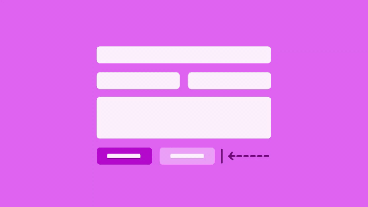
- Prototype A: Dialog with right-aligned buttons ordered left-to-right
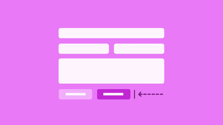
- Prototype B: Dialog with right-aligned buttons ordered right-to-left
- Prototype C: Dialog with full-width buttons ordered left-to-right
- Prototype D: Dialog with full-width buttons ordered right-to-left
Test Platform and Testers
We chose to use Maze to run our experiment. We decided to use Maze for the following reasons:
- Maze allows you to hire testers through their platform and recruit your own testers. You can even differentiate your recruited testers by providing custom parameters in the test URL.
- Maze integrates with Figma.
- Maze provides useful and beautiful metrics.
💡 Protip: we initially ran into some issues setting up a Maze split test with their Figma integration. See the “Bonus Content” section below for how we overcame this.
My Hypothesis
I predict that these prototypes will perform pretty consistently across the board. Jakob Nielson said it best in his research for The Nielson Norman Group:
"In cases like this, it often doesn’t matter what you do. Either choice has good arguments in its favor, and no choice is likely to cause usability catastrophes. It might save some users 0.1 seconds if you pick the “right” choice for certain circumstances… "
– Jakob Nielson, on button sort order
Test Results
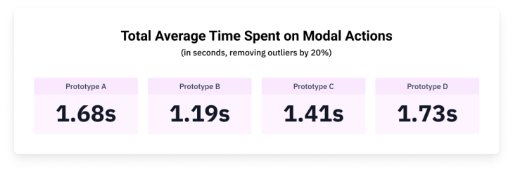
Technically, Prototype B is the winner based on our tests. Congratulations, Prototype B, you did it!.. but not by much!

As you can see by looking at the total time averages, the prototypes performed very similarly. The largest spread was between Prototype B and D, representing a difference of 0.54 seconds. If we ran several hundred more tests, I expect these numbers would get even closer together.
Revisiting my hypothesis, I expected that the prototypes would perform similarly. In line with Jakob Nielson, the general outcome of our tests is that it likely doesn’t matter which specific pattern you choose as long as you do… well… choose (one).
But wait! There is more data to dig into! Let’s dig a little deeper than just the total average time spent.
Analyzing how participants spent time on a per-modal-basis is a bit more fascinating. One mostly consistent pattern is that the test users tended to get faster selecting a modal action with each modal they were provided. This could show us how users learn and get used to a product’s patterns as they experience more of the product. Or, it could just be a quirk of the prototype itself.
It would be interesting to test another prototype that used inconsistent patterns throughout. Testing this prototype would show us how UI consistency helps users perform better over time.
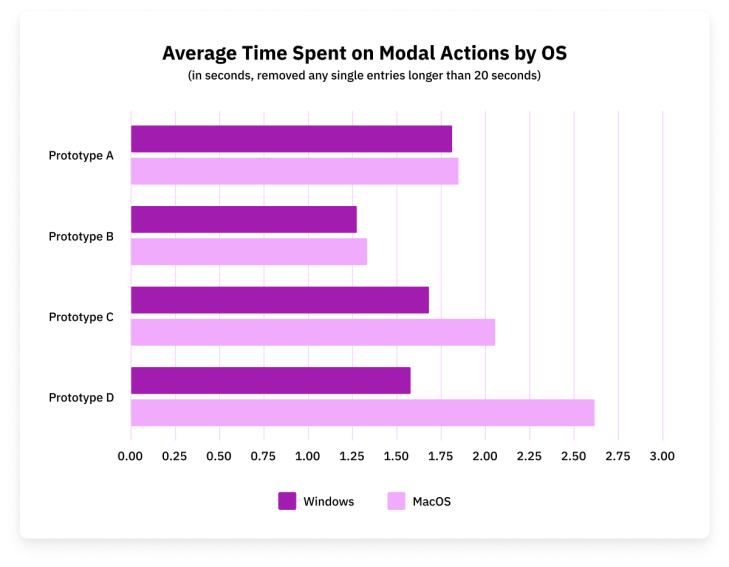
Interestingly enough, Windows users outperformed macOS users in every instance. Our previous research expected macOS users would prefer Prototypes A and C, while Windows users would prefer Prototypes B and D. However, based on our testing, we found this to not be the case.
The biggest difference between these users was the use of full-width modal buttons. macOS users consistently underperformed while using these prototypes.
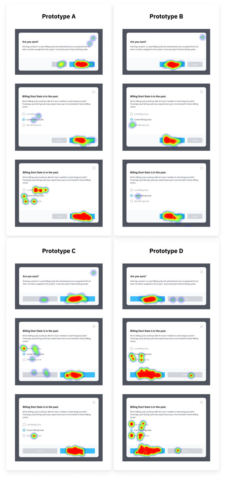
Above are the click heat maps generated for each instance of the modal presented to our testers. I believe it is best to ignore the clicks on the modal form (radio selection group). These clicks are likely due to the nature of a prototype. If this product was real, these users would likely not feel the need to commit extra clicks here.
In each prototype, we observe the users becoming more accurate as they address more modals. While addressing the first modal, users often accidentally clicked the “Cancel” button and the “X” close icon. By the last modal, these inaccuracies were reduced. This again shows evidence of the user learning the product and adapting to what pattern (i.e. button sort order) to expect.
Key Takeaways
When it comes to button group alignment and the order they’re sorted, the most important thing is consistency. If there is already a pattern your specific users are used to, stick to it. Creating inconsistencies here will likely only have a negative impact.
If your product has existing patterns, but they’re not documented for your team somewhere, document them! A great example of this sort of documentation is IBM’s Carbon Design System.
If there are no existing patterns to follow in button group alignment and sort order, the following is an excellent place to start:
- On page level forms, left-align button groups. Rationale: Luke Wroblewski’s article, user’s scan page-level content in an “F” flow (see Artem Syzonenko’s research or The Neilson Norman Group), and lastly, because most of the page content is already left-aligned.
- On page level forms, order the buttons primary-to-secondary, from left-to-right. Rationale: this follows the “natural” reading order (for western-languages) and increases the completion rate. See Artem Syzonenko’s research.
- In modals and dialogs, align the buttons to the right, or possibly consider a center alignment. Rationale: all major platforms (Windows & macOS) right-align the terminating actions buttons in modals/dialogs, users scan modals in a “Z” pattern (check out the “Gutenberg Diagram”).
- In modals and dialogs, order the buttons primary-to-secondary, from left-to-right. Rationale: our testing shows us that this pattern performed the best in both speed and accuracy (but the differences were less than a second), taking on this approach keeps it consistent with the page-level order recommendation and the natural reading order. 🙋♂️ Worth noting that this is really splitting hairs, as Jakob Neilson said, “In cases like this, it often doesn’t matter what you do. Either choice has good arguments in its favor, and no choice is likely to cause usability catastrophes.”
Bonus Content
A couple of things I learned along the way
- Maze has an amazing support team, more on this below.
- When creating A/B(C/D) split tests in Maze, Figma users are required to name their versions in the Figma version history in order for one test to not override another. There’s no way I could have figured this out without the help of Maze Support (thank you!).
- Add more user paths to the Maze tests. This will make the reports make more sense on completion.
- I should have included a prototype version that used inconsistent ordering/alignment between pages to see how that would impact the user.
- When performing an A/B(C/D) split test, Maze does not currently offer a way to properly and evenly funnel your unpaid recruited participants between tests. To work around this, I threw together a Google Scripts web app that looked something like the image below. One of the Maze test links was then randomly chosen and applied to a button upon each visit using javascript.
- Maze does not currently allow you to filter participant data based on metadata within their platform (though I see it’s a likely future feature). To work around this I exported the .CSV files for each prototype (which does include metadata), imported them into Google Sheets, and analyzed everything there. Feel free to check out my Google Sheet to get a sense of how I analyzed the data. The sheet also includes the original imported data from Maze.
🔗 Source links for all the things!
- Figma file: article assets and prototypes used for the Maze tests
- Prototype A: Maze Report (direct/indirect path stats are irrelevant)
- Prototype B: Maze Report (direct/indirect path stats are irrelevant)
- Prototype C: Maze Report (direct/indirect path stats are irrelevant)
- Prototype D: Maze Report (direct/indirect path stats are irrelevant)
- Google Sheet with imported data from Maze and my own data consolidation


